One Room Challenge: Bathroom Reveal!
WEEK 1 | WEEK 2 | WEEK 3 | WEEK 4 | WEEK 5 | WEEK 6-7
Today is the day - I am so excited to share our guest bathroom transformation!
The past 8 weeks involved countless hours designing this space, a ton of fun, a DIY first, and pushed me outside my personal design aesthetic for my home.
I discovered the One Room Challenge about one week before it began and knew I had to sign up. I quickly started scheming a design concept. Our guest bathroom had essentially been neglected from a design standpoint since moving in nearly three years ago. Our condo is very modern and I wanted to add character by incorporating traditional elements like picture frame molding and a beautiful wallpaper. I always love using vintage pieces so some secondhand shopping was in order as well.
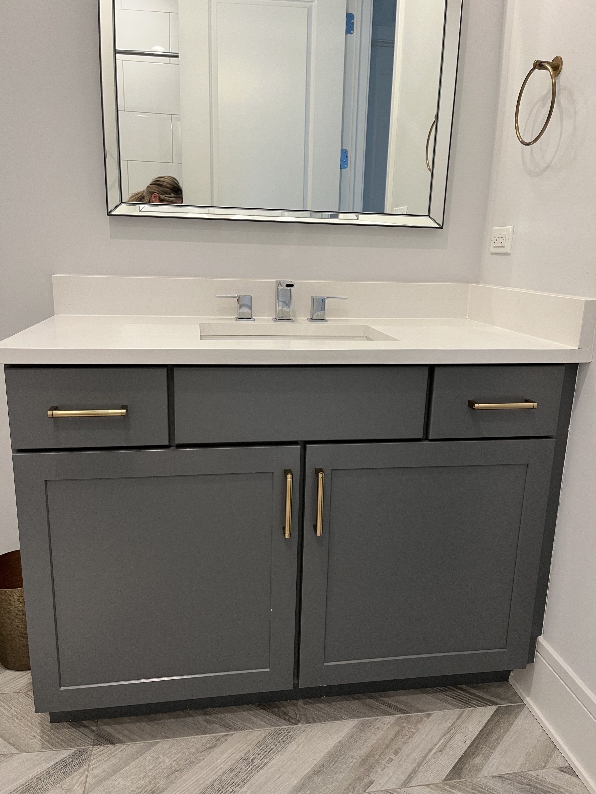
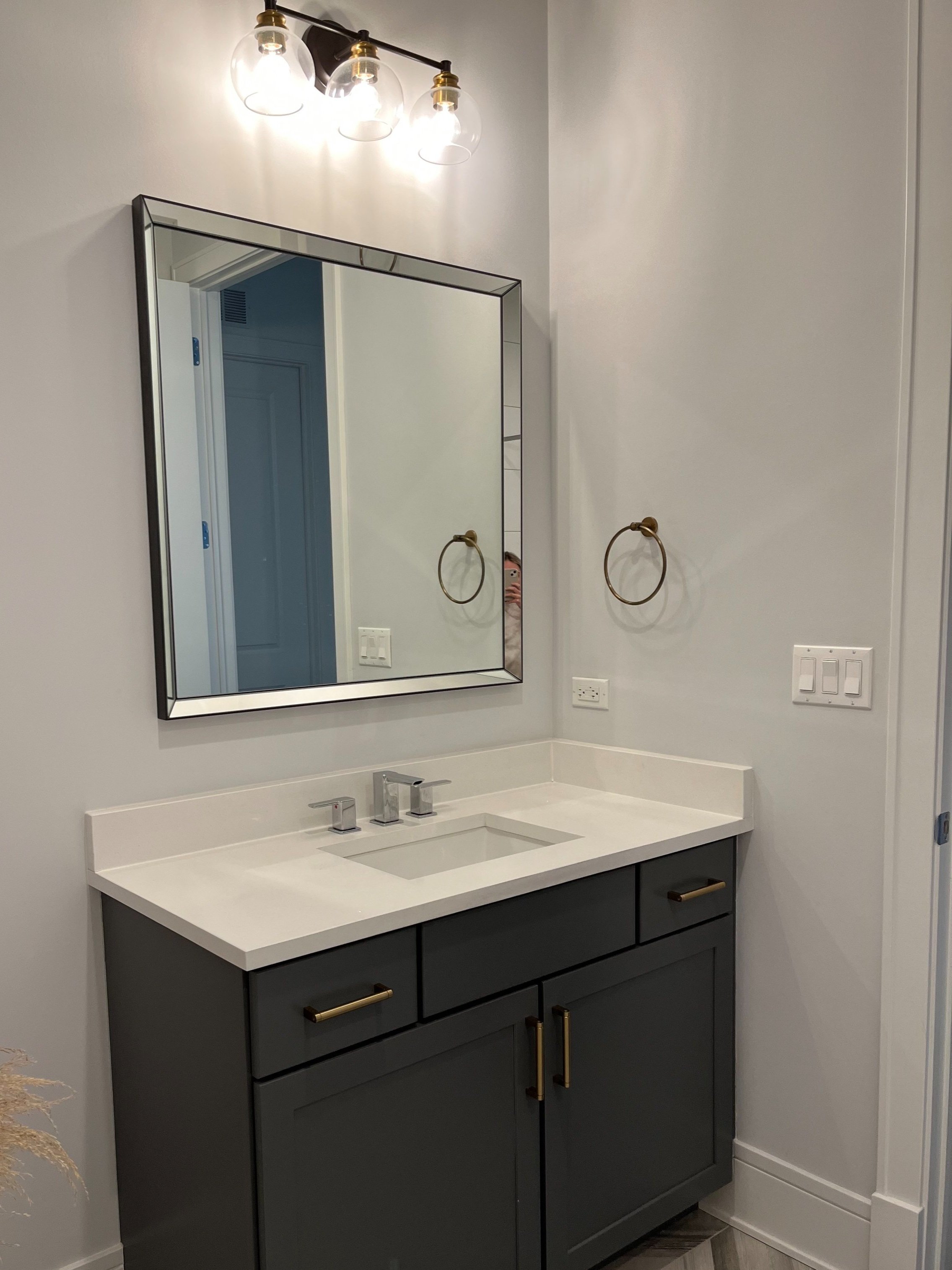
Here are the before and after photos...
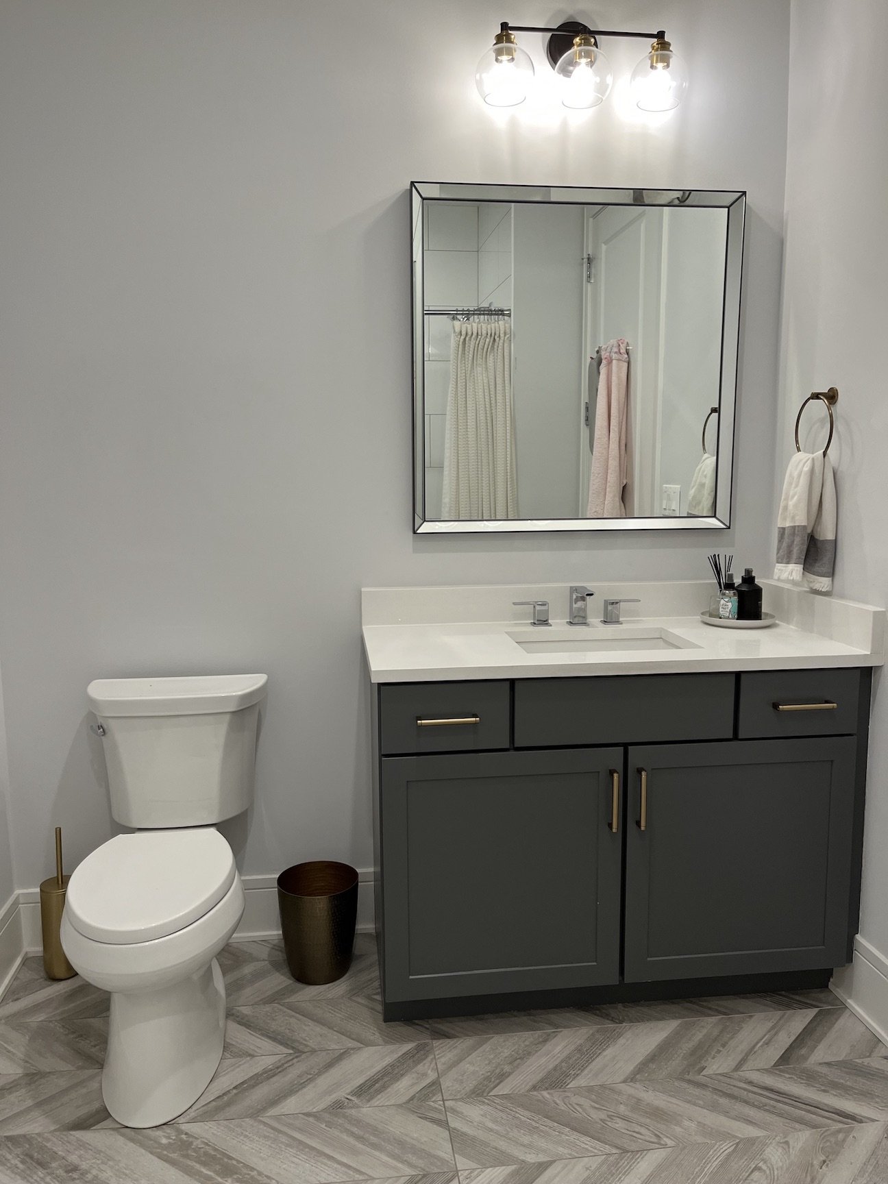
THE BEFORE
Good base but is lacking personality!
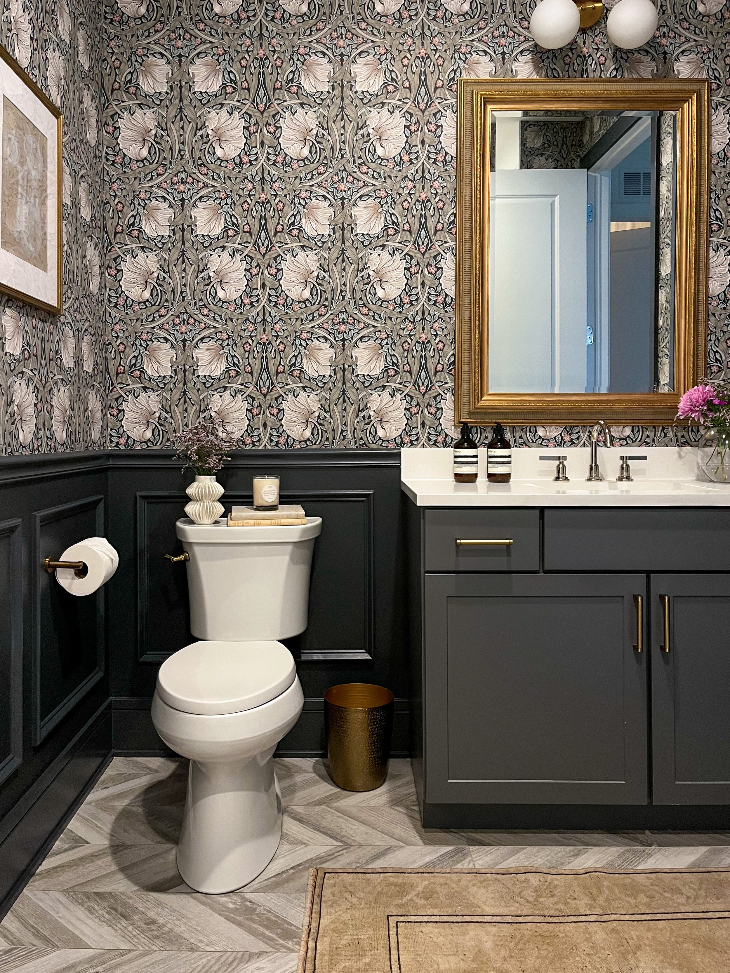
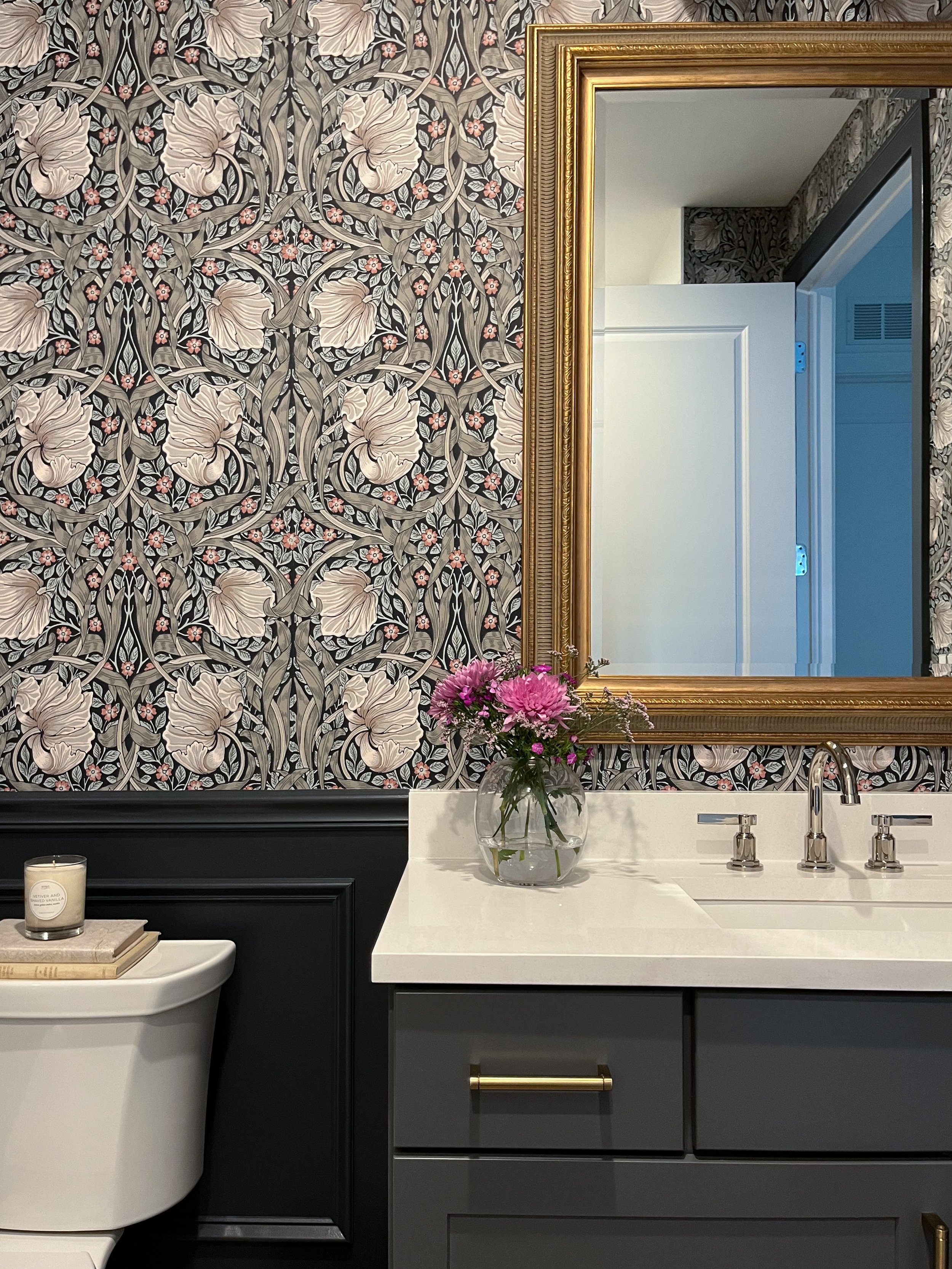
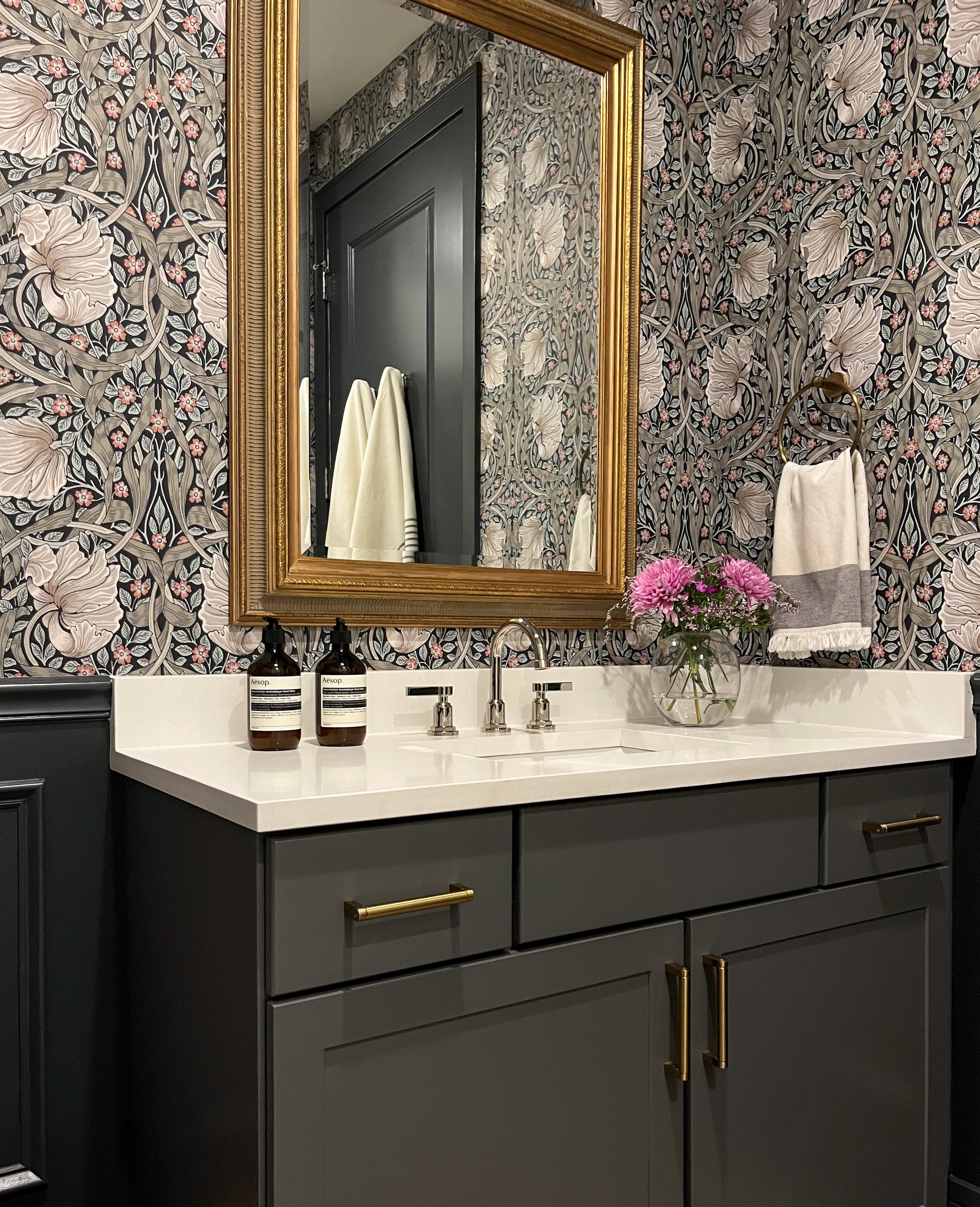
THE AFTER
I couldn’t love how the space turned out more! I feel like I’m walking into a little jewel box in our condo which has primarily neutral tones. Mixing in vintage elements such as antique gold frames, the vintage brass mirror and a traditional wallpaper pattern brings contrast to the more modern space.
THE WALLS
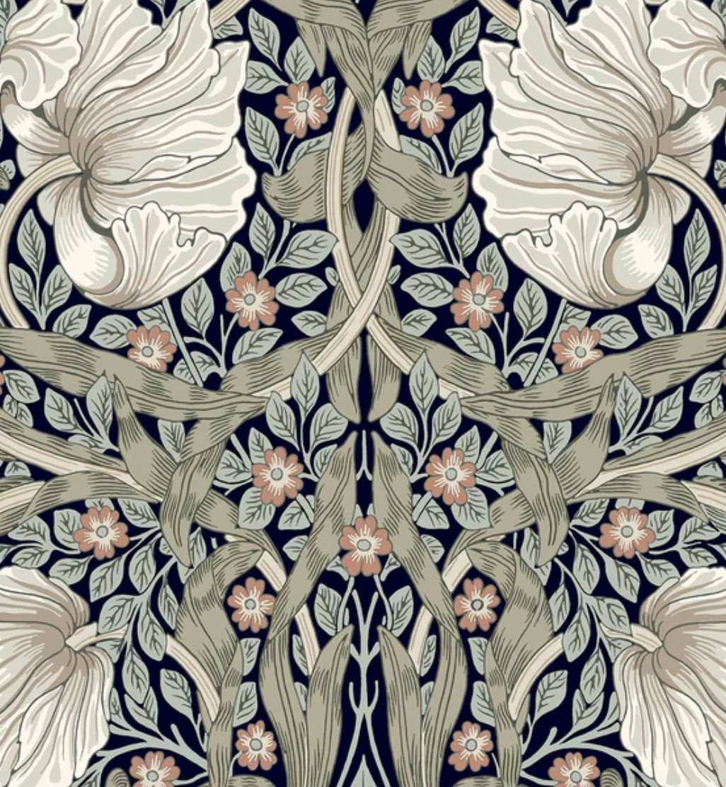
I ended up straying from my initial design board which had a softer color palette once I surprised myself and decided on this darker floral Morris & Co. wallpaper. I absolutely love the mix of deeper tones and how they complement the vanity.
My big DIY project for this space was the addition of wainscoting with applied picture frame molding.
Once the wallpaper was installed, I knew I wanted to go dark for the wainscoting. I am so happy with Benjamin Moore Hale Navy - it’s a deep navy blue in this room and looks so rich, providing the perfect contrast to the wallpaper.
THE MIRROR & LIGHTING
I found this mirror on FB Marketplace for thirty dollars and fell in love with its detail. The soft green-gray trim around the edge pairs perfectly with the wallpaper - I couldn’t have planned that better if I tried!
I used Rub n Buff in Antique Gold to tone down the innermost part of the frame which looked orange.
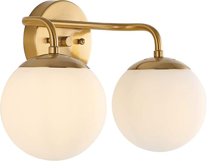
The vanity light is the perfect mix of modern juxtaposed against the vintage mirror.
THE ART
I wanted something simpler and modern to provide some visual relief and contrast with the busy, traditional wallpaper. I purchased the vintage style matted frames and ended up creating the art myself using acrylic paint and charcoal pencil. It took about thirty minutes not included drying time and I love how they turned out.
THE FAUCET
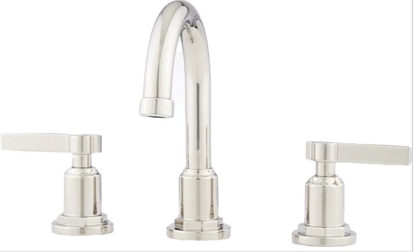
I love how this Signature Hardware faucet in Polished Nickel has both modern and traditional elements. Polished Nickel is such a great finish because it has a warm undertone, so it pairs well with many other metals. I was able to find this new in box at nearly half off of retail price on eBay!
THE DETAILS
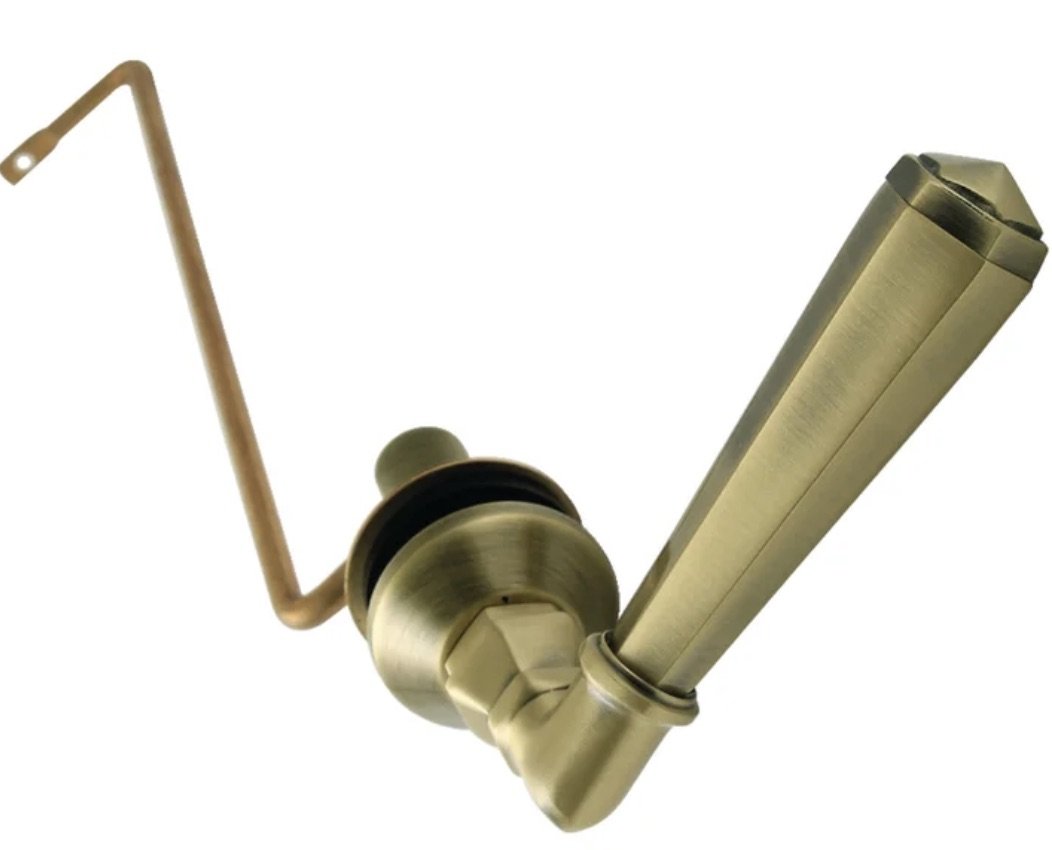
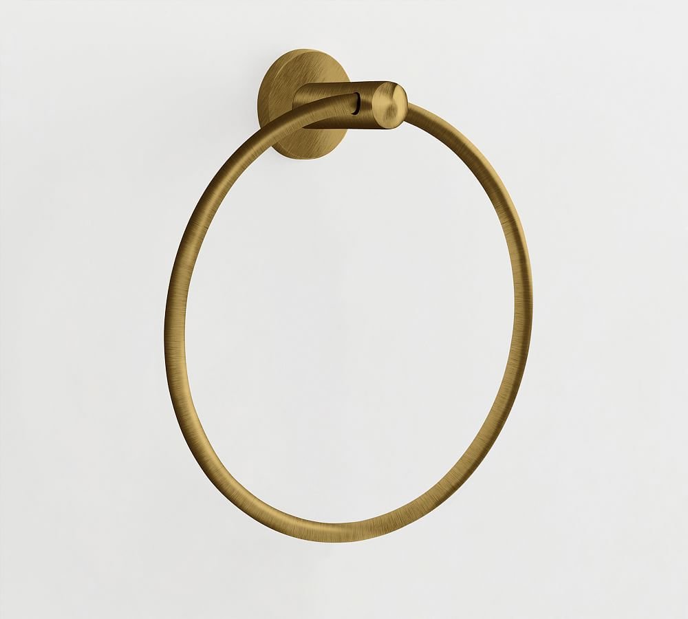
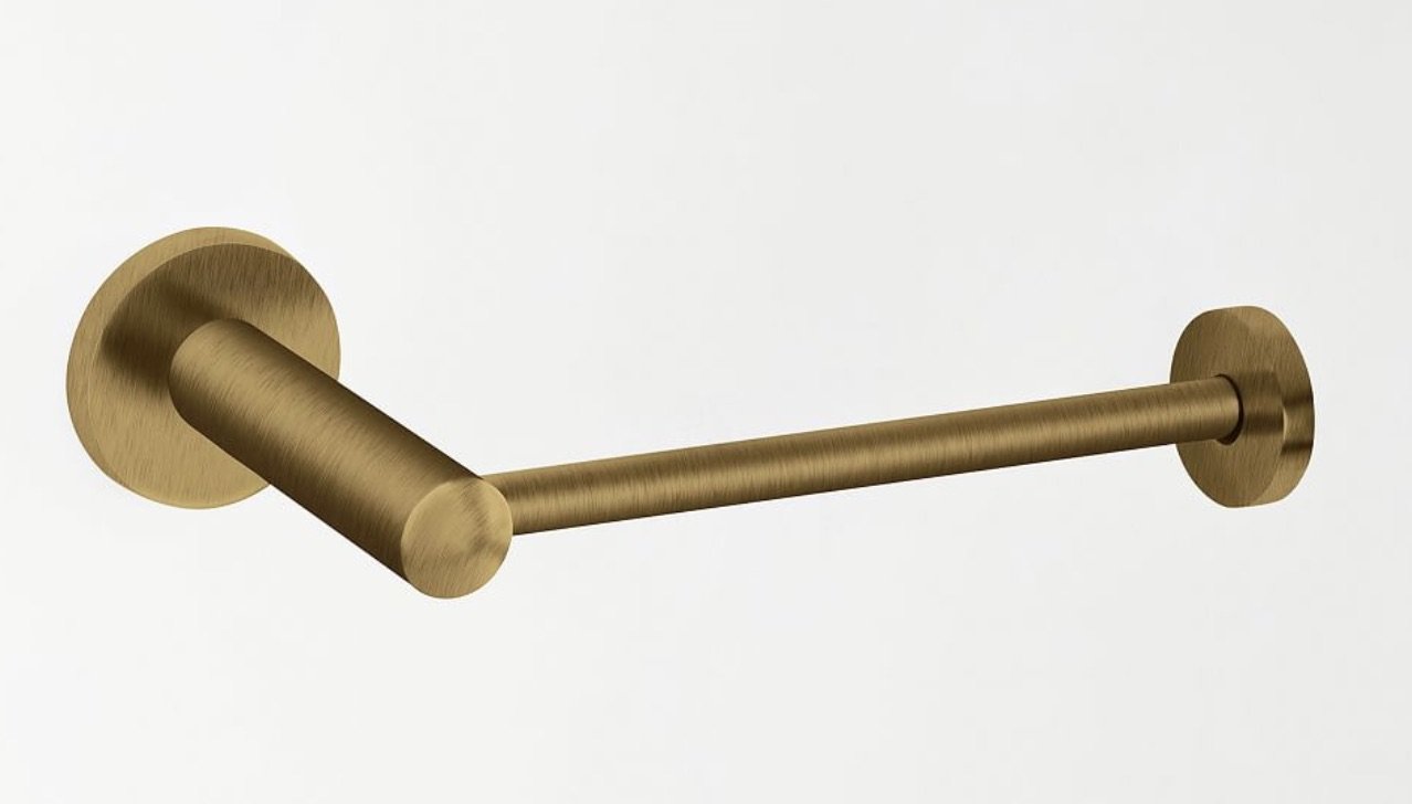
I replaced the chrome toilet handle with an antique brass one to maintain the brass look throughout the space.
I knew I wanted a vintage rug and found this one on Etsy. I love the warmth it brings to the room.
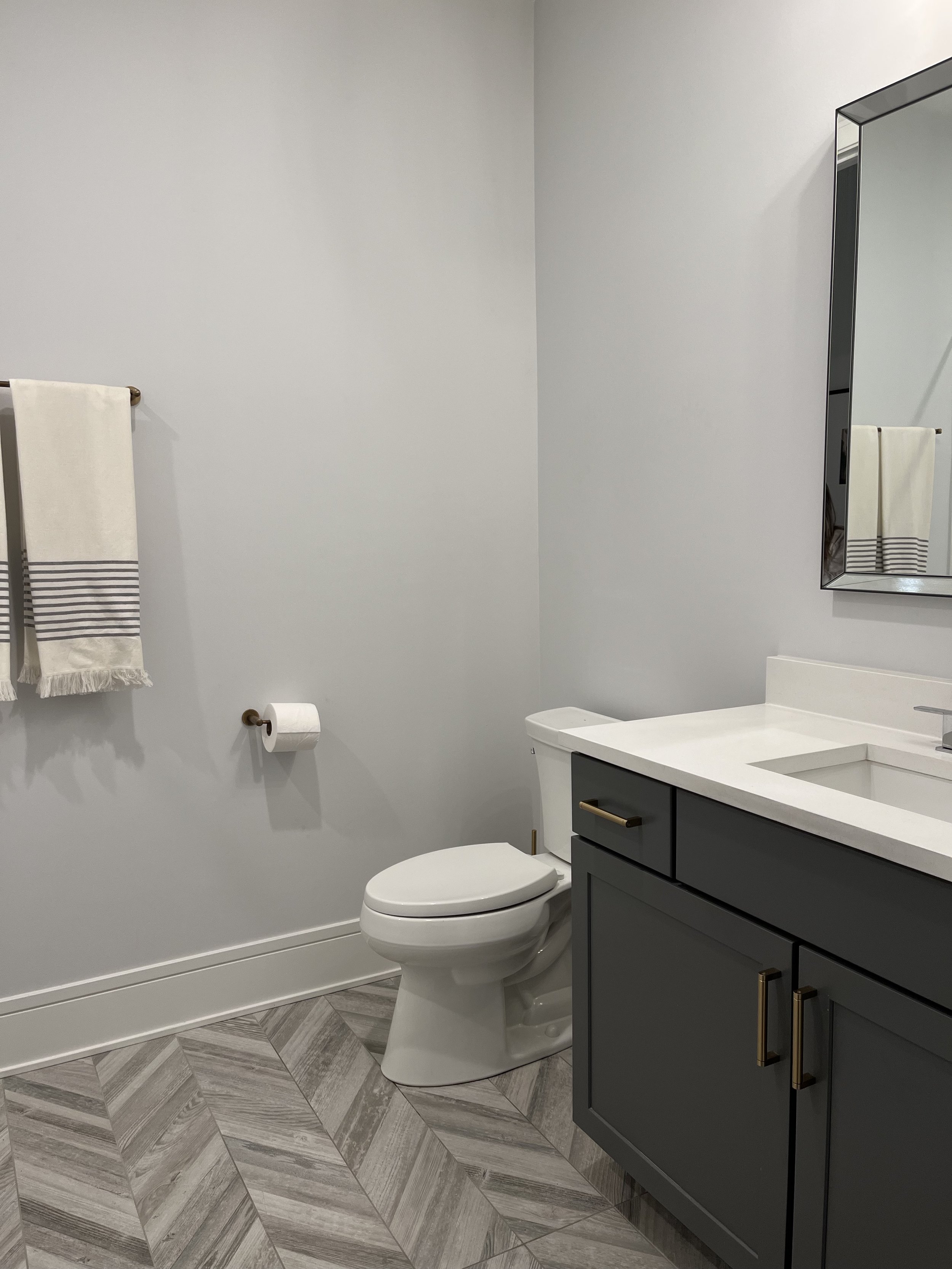
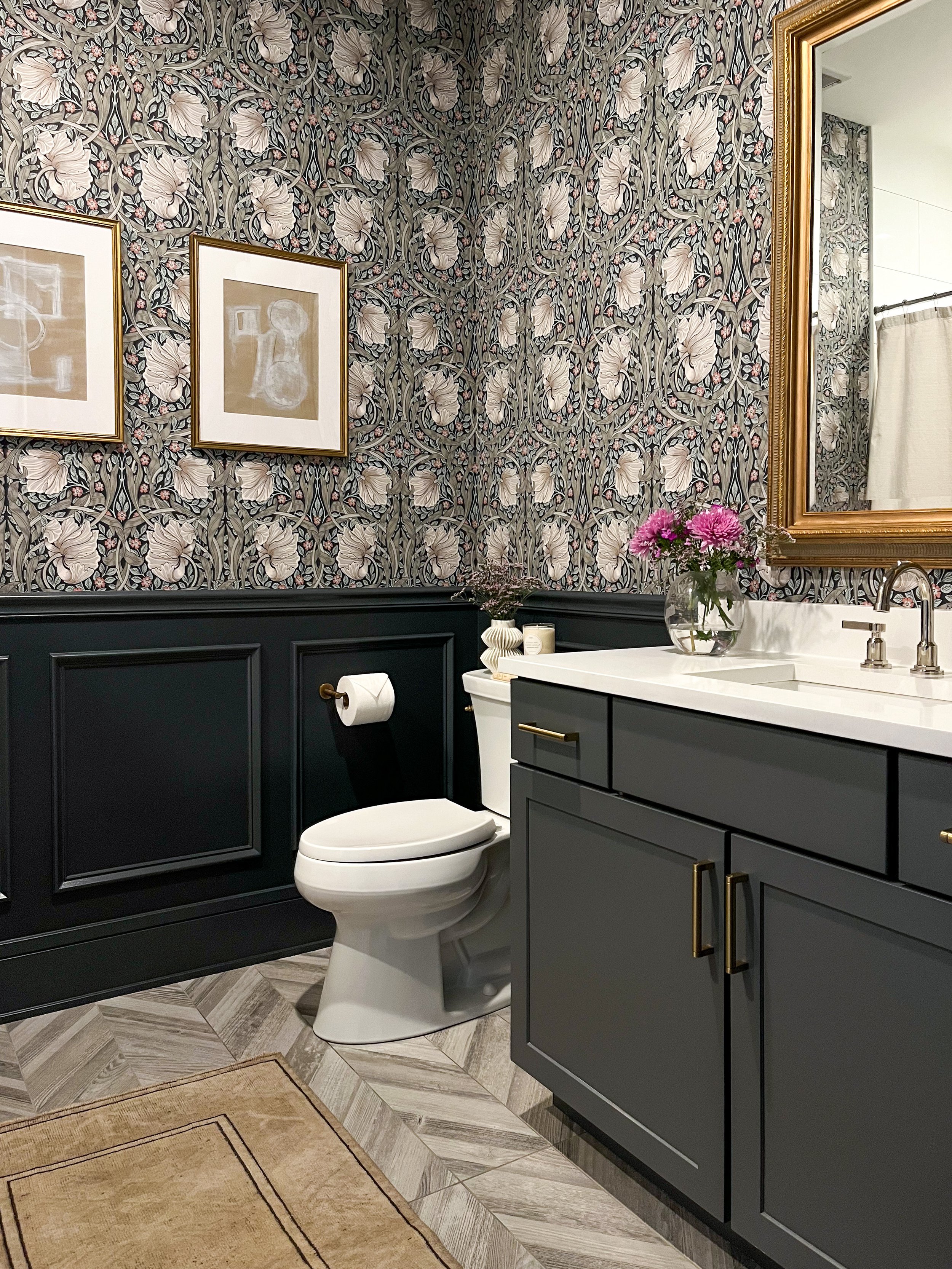
A few before + after comparisons to show just how much this room changed…
ROOM SOURCES
I’m so glad I discovered the One Room Challenge! It’s such a fun way to get involved this incredible community of DIYers and designers to transform a space on a tight timeline. It also motivated me to DIY something I would have previously hired out. A special thank you to Apartment Therapy for hosting the event and featuring my bathroom here!
See the other amazing transformations on the ORC site here!


